QTE DevLog #3
Back with a quick update today! Unsurprisingly I've found much more time to work on the game nowadays - which means I've made significant progress. I'm aiming to have a playable demo/build for the next update so I can get some feedback and see what works, and what doesn't!
Current State
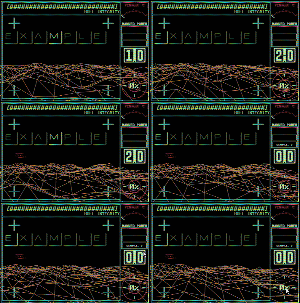
As most of the programming is finished, I've been working a lot on the art of QTE this week, so feast your eyes on these pretty gifs!

I'm currently experimenting with an old VHS/Retro filter to give the desired "dodgy old computer" effect. I'm really happy with how it's going so far. I had planned this from the start but before actually applying the filter it was hard to design UI without it - some tweaks to colour and visibility for certain elements should be all that's needed to change here.
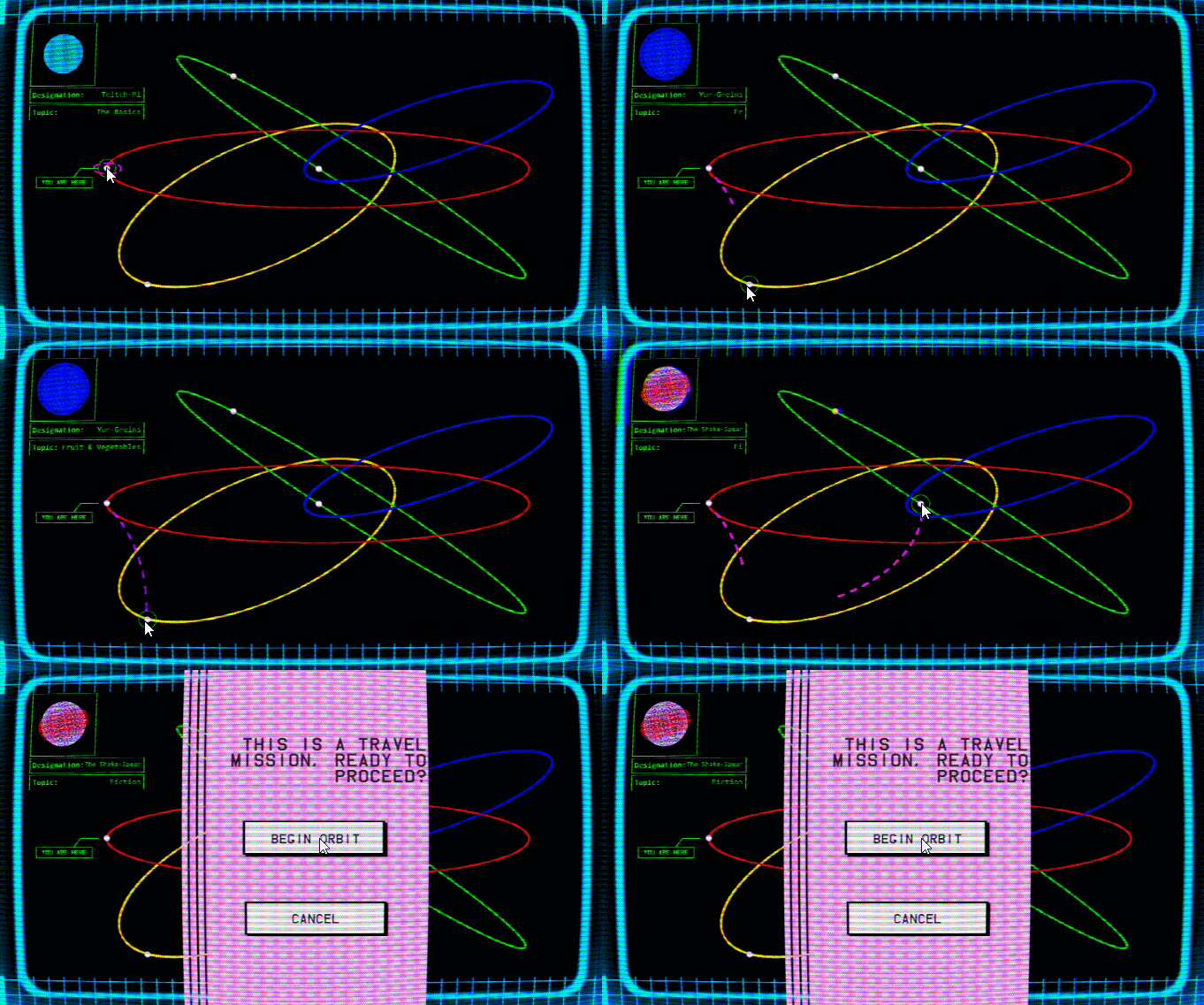
Planet Selection Screen
One of the most important parts of my menus is the Planet Selection Screen, here's how its currently shaping up:

Each planet has its own little design, with its topic that you'll have to teach it on the mission - deciding what words you'll have to spell. Coming up for a ton of different words for fruit and veg is harder than you think.
That's all for this week
Thanks for reading, and I hope you're all coping okay in the current climate - hopefully i'll have something playable to distract you all soon :)
Get QTE
QTE
QTE: Quanta Typing Engine
More posts
- QTE DevLog #4: Playable build!Jun 02, 2020
- QTE DevLog #2Feb 06, 2020
- QTE DevLog #1Aug 10, 2019

Leave a comment
Log in with itch.io to leave a comment.